How to Photograph Archival Documents: A Field Method for Legibility and Faithful Capture
Photographing archival documents in reading rooms, with practical guidance on handheld capture, lighting, focus, geometry, file formats, and handling originals without damaging them.
Leo Team
July 20, 2026
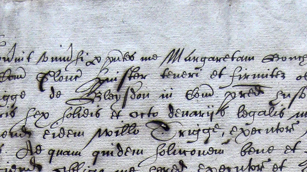
This is a working method for photographing archival documents in the reading room — the decisions that decide whether a capture is legible enough to read, search, and transcribe, and how to make them without harming the original. It is built for researchers, genealogists, and heritage staff who shoot with the camera they carry, and it puts geometry, focus, and even light ahead of megapixel counts.
Photographing archival documents well means capturing an image sharp enough, even enough, and geometrically true enough that the text is fully legible — and doing it without harming the original. In practice that comes down to five things: shoot square to the page, light it evenly and diffusely, hold everything still, expose for the faint strokes rather than the bright paper, and save an uncompressed master file. Resolution matters, but it matters less than most people think; geometry, focus, and lighting evenness decide whether a capture is usable. A modern smartphone, used carefully, produces images that are entirely serviceable for reading and transcription.
That last point is worth stating plainly at the outset, because the temptation in the reading room is to worry about megapixels. The camera is rarely the limiting factor. The setup around it is.
This guide covers the decisions that actually govern capture quality, in roughly the order you make them: what the archive will let you do, how to handle the original, how to light and frame it, what to set on the camera, and how to save the file so that everything downstream — reading, searching, transcription — has good material to work with.
First, the reading room's rules — because they override everything else
Before any technique, know what the institution permits. Policy varies widely from one archive to the next, changes often, and is not negotiable at the desk. Most reading rooms now allow personal photography with a handheld camera, phone, or tablet: The National Archives (UK), for instance, permits imaging with a hand-held camera, smartphone, tablet, or laptop for personal research use. But the common restrictions are consistent enough to plan around:
- No flash. This is near-universal, and for good reason (below).
- No tripods or copy stands, often. Many reading rooms prohibit anything that occupies neighbouring desk space or looks like a commercial setup. This is the single most consequential constraint, because it usually means handheld capture.
- Supports and weights supplied by the archive only. You generally cannot bring your own cradle or weights; you use theirs, or you manage without.
- Personal use only. Permission to photograph is rarely permission to publish.
Check the specific institution's page before you travel, and confirm at the desk. A wasted trip because tripods turned out to be banned is a more common failure than any technical one.
Handling the original: the capture is never worth the document
The order of priority is fixed. The document outlives your project, and a capture is not worth a tear, a crease, or a lifted flake of iron-gall ink.
Two points of received wisdom deserve correcting. First, gloves. The instinct to reach for white cotton gloves is now considered wrong for most paper and parchment. Current conservation guidance — the British Library among others — prefers clean, dry bare hands, because gloves reduce dexterity, raise the risk of dropping or catching a leaf, shed fibres, and can lift pigment. Gloves remain indicated for certain photographs, some vellum, and metals or dyes — but reach for them because a conservator tells you to, not by reflex.
Second, do not force a binding flat. A tightly bound volume should be supported open at whatever angle it will comfortably hold, in a cradle or on foam wedges if the archive provides them. Snake weights or a Mylar strip can hold a page without pressure on the text. Photographing a curved page at an angle is a lesser evil than cracking a spine to flatten it — and, as we will see, a curved page is often recoverable in the frame where a broken binding is not recoverable at all.
Lighting: even and diffuse beats bright
More light is not better light. The failure modes that actually destroy legibility are hot spots, specular glare, and clipped highlights — all of them problems of unevenness and excess, not of insufficient brightness.
Flash is the classic mistake. It is prohibited in most reading rooms on three grounds, all valid: cumulative light exposure is a genuine preservation risk for sensitive items — the Library of Congress notes that light-sensitive items should never be needlessly exposed, and brief flashes accumulate across many pages; flash throws harsh specular glare off glossy or coated surfaces and off the sheen of iron-gall ink, wiping out exactly the strokes you need; and it disturbs everyone around you. Turn it off and leave it off.
What you want instead is soft, even, roughly axial illumination — diffuse ambient room light, or two matched sources at equal angles either side of the page if the archive permits them. The test is not brightness but evenness: no bright patch in one corner and shadow in the opposite one. Overhead lighting alone often casts the shadow of your own phone across the page; watch for it.
Beware, too, of the assumption that HDR mode clarifies text. It usually does the opposite. HDR blends several bracketed exposures, and that averaging can wash out faint, low-contrast strokes — the pale end of an iron-gall line — and produce ghosting where a warped page moves between frames. For documents, a single well-judged exposure with even light beats a composite every time. Switch HDR off.
One specialist exception is worth knowing about, though you will rarely deploy it at a reading-room desk: raking light, a low, oblique beam that grazes the surface. It reveals topography — impressed or heavily faded strokes, a blind ruling, a watermark — that flat axial light misses. It is a diagnostic tool for a specific problem, not a general-purpose method, and it distorts tone badly for ordinary reading. Keep it in reserve.
Geometry and focus: the two things you cannot fix later
If there is one technical idea to carry out of this guide, it is that perspective distortion and soft focus are frequently unrecoverable, whereas modest resolution is usually fine. Spend your attention here.
Shoot square to the page. The sensor plane should be parallel to the document. When it is not, you get keystone distortion — the trapezoidal squashing where one edge of the page renders larger than the other — and, worse, the effective resolution shifts across the frame and part of the page drifts out of focus. Mild keystoning can sometimes be corrected in software when the geometry is recoverable, but severe perspective distortion, uneven focus, and focus falloff at the edges cannot reliably be undone. The document-scanner apps that promise to straighten a photo help with edge detection and cannot conjure back detail that the geometry lost. Get it right in the frame: centre the page, hold the camera flat above it, fill the frame without cropping into the text.
Get the focus right and keep it still. Handheld, at reading-room light levels, motion blur is the quiet killer of legibility — it softens letterforms just enough that fine distinctions blur. Brace your elbows on the desk, tap to focus on the text itself, use a shutter delay or the volume-button release to avoid jogging the phone, and take two or three frames so you can discard the soft ones. If a page is warped, focus on the region of text you most need and accept that the far edge may soften; a second frame focused on that edge is cheaper than a return trip.
This is also why the "megapixels equal quality" instinct misleads. As the FADGI guidelines make explicit, image quality is governed jointly by pixel density, lens sharpness, focus accuracy, lighting evenness, and stability. A high-megapixel sensor over a skewed, dim, motion-blurred capture still yields a poor image. The pixel count is the least of it.
How much resolution is enough
Preservation-grade digitisation targets are high and precise. FADGI's four-star tier for reflective text calls for roughly 396 ppi at the object — a 1% tolerance below 400 — with tight limits on tonal deviation and colour accuracy. The Metamorfoze guidelines set 300 ppi for originals A5 and larger, rising toward 600 ppi for anything smaller. These are the standards an institution's imaging department works to, and if you are building a preservation master they are the numbers that matter.
For a researcher photographing for their own reading and transcription, the bar is lower and more forgiving. Practitioner consensus puts around 300 dpi as a comfortable working baseline for text, and Transkribus community guidance notes that even 150 dpi can suffice for some recognition tasks. The point is not to chase a number but to resolve the script: fill the frame with the page so the smallest meaningful stroke — the hairline of a secretary-hand e, the tittle over an i, an abbreviation mark — lands across several pixels rather than one. Beyond the resolution needed to render those features cleanly, extra pixels give diminishing returns unless your lens and focus can actually support them. A frame-filling, sharp, evenly lit phone photo of a single page clears this bar without difficulty.
Exposure and file format: protect the faint strokes, keep the master
Expose for the faint ink, not the bright paper. The detail you can least afford to lose is the palest stroke — a dilute iron-gall line, a rubbed-out correction, a marginal note in a lighter hand. Overexposure clips the highlights and takes those with it. Err very slightly toward underexposure and even, shadowless lighting, so the full tonal range of the ink survives.
Save a proper master file. If your phone can shoot RAW or DNG, use it; if not, set the highest-quality capture available. The archival standard for a master is an uncompressed TIFF or lossless JPEG 2000 at 16 bits per channel — full lossless capture is what preserves tonal gradation and avoids compression artefacts. Heavily compressed JPEG introduces blocking and ringing that degrade both human legibility and machine recognition. JPEG is fine as a derivative — an access copy to email or drop into a document — but keep an unaltered, high-quality original as your master and work from copies. You cannot add back what compression discarded.
From good captures to readable text
A careful capture is the input to everything that follows. Once you are home with a folder of sharp, square, evenly lit images, the work shifts from photography to reading — and this is where the quality of your capture earns its keep, because the same qualities that make a page legible to your eye make it legible to a transcription engine. Even, artefact-free lighting; true geometry; the faint strokes preserved rather than clipped: these are what let software read a hand rather than guess at it.
It is also where the distinction between reading a page and smoothing it becomes decisive. Handwritten historical material — secretary hand, the abbreviations and ligatures of scribal shorthand, the archaic spelling and interlineations of an early modern manuscript — is precisely the material that general-purpose OCR and general chatbots handle badly. General OCR is engineered for clean modern type and its assumptions break on manuscript hands and historical print alike; general-purpose LLMs, worse, tend to return fluent, plausible prose that quietly departs from what is on the page — a dangerous failure mode, because a confident fabrication is far harder to catch than a garbled character. This is why ChatGPT struggles with historical handwriting.
This is the stage where a purpose-built tool earns its place. Leo's transcription model, ATR-1, is trained on images of historical documents to transcribe what is actually on the page — preserving strikethroughs, marginal additions, expansions, and archaic orthography rather than normalising them into modern prose. It reads Latin-script material whatever the language on the page — English wills, French notarial records, Dutch and German registers, and Latin among them — and it reads printed matter too, including the early-modern founts, the long s, and the ligatures that trip conventional OCR. It works directly from the images you supply, including photographs sent straight from a phone; there is no custom model to train first, and you can upload a page and read the result the same afternoon. That is a workflow question, not a photography one, and it belongs after the shutter has done its job — but it is the reason to get the shutter right.
The habit that makes the difference
None of this requires a copy stand or a five-figure camera. It requires attention to the handful of things that decide whether a photograph is legible: the geometry, the focus, the evenness of the light, and a master file you have not thrown detail away from. A researcher who shoots square, holds steady, kills the flash and the HDR, exposes for the faint strokes, and keeps a lossless original will come home with images that serve for years — and will not find, three months and one closed archive later, that the one record standing between them and the next step is the one they photographed at an angle in poor light. Get the capture right, and everything after it has a fighting chance.
Frequently Asked Questions
How do you photograph archival documents so the text stays legible?
Photograph archival documents by getting five things right: shoot square to the page so the sensor plane is parallel and you avoid keystone distortion, light the page evenly and diffusely to prevent hot spots and glare, hold everything still to defeat motion blur, expose for the faint strokes rather than the bright paper, and save an uncompressed master file. Resolution matters less than most people assume — geometry, focus, and lighting evenness decide whether a capture is usable. A modern smartphone, used carefully, produces images that are entirely serviceable for reading and transcription. The setup around the camera, not the camera itself, is usually the limiting factor.
Can you use a smartphone to photograph documents in an archive?
Yes — most reading rooms now permit personal photography with a handheld camera, phone, or tablet for personal research use, and a modern smartphone used carefully produces images serviceable for reading and transcription. The camera is rarely the limiting factor; the setup around it is. Because tripods and copy stands are often banned, you will usually be shooting handheld, so brace your elbows on the desk, tap to focus on the text, use a shutter delay or the volume button to avoid jogging the phone, and take two or three frames to discard the soft ones. Always check the specific institution's rules before you travel and confirm at the desk.
Should you wear white cotton gloves when handling old documents?
No — for most paper and parchment, current conservation guidance prefers clean, dry bare hands over white cotton gloves. Gloves reduce dexterity, raise the risk of dropping or catching a leaf, shed fibres, and can lift pigment, all of which endanger the document more than clean hands do. Gloves remain indicated for certain photographs, some vellum, and metals or dyes — but reach for them because a conservator tells you to, not by reflex. The order of priority is fixed: the document outlives your project, and no capture is worth a tear, a crease, or a lifted flake of iron-gall ink.
Why shouldn't you use flash when photographing archival documents?
Flash is prohibited in most reading rooms on three valid grounds. First, cumulative light exposure is a genuine preservation risk for sensitive items, and brief flashes accumulate across many pages. Second, flash throws harsh specular glare off glossy or coated surfaces and off the sheen of iron-gall ink, wiping out exactly the strokes you need to read. Third, it disturbs everyone around you. Turn it off and leave it off. What you want instead is soft, even, roughly axial illumination — diffuse ambient light, or two matched sources at equal angles either side of the page. The test is not brightness but evenness: no bright patch in one corner and shadow in the opposite one.
How many megapixels do you need to photograph documents for transcription?
Fewer than most people think — the goal is not a pixel count but resolving the script. For a researcher photographing for their own reading and transcription, around 300 dpi is a comfortable working baseline for text, and some recognition tasks can work with as little as 150 dpi. What matters is filling the frame with the page so the smallest meaningful stroke — the hairline of a secretary-hand letter, the tittle over an i, an abbreviation mark — lands across several pixels rather than one. Preservation-grade institutional standards are far higher, but for reading and transcription a frame-filling, sharp, evenly lit phone photo of a single page clears the bar without difficulty. Extra pixels give diminishing returns unless your lens and focus can support them.